Our story thus far is here. Tl;dr: I looked at a bunch of monospace fonts and recommended a 2023-2-15 04:0:0 Author: www.tbray.org(查看原文) 阅读量:30 收藏
Our story thus far is here. Tl;dr: I looked at a bunch of monospace fonts and recommended a few. The piece went kind of nuts, way past 50K views as I write this, and a flood of comments here and on YCombinator, nearly all of which took the form of “You left out my favorite font, which is X!” So I harvested 14 values of X, and let’s have a look at them! I’ve enjoyed this little project enough to pay actual real money for three of these.
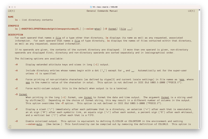
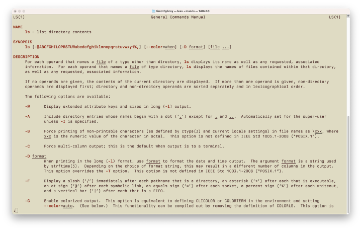
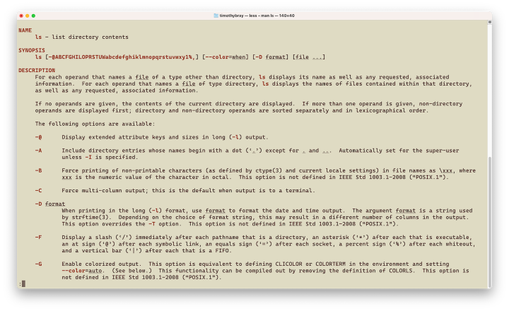
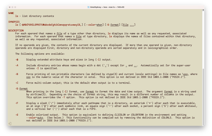
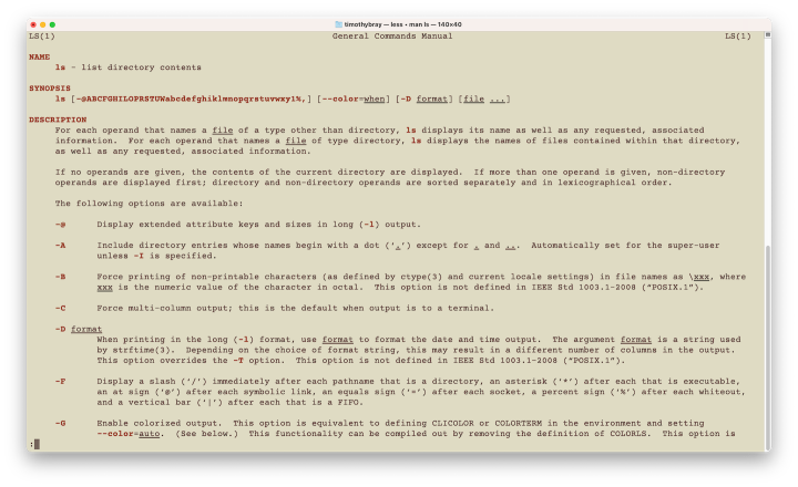
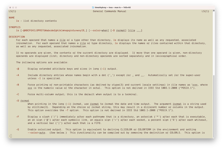
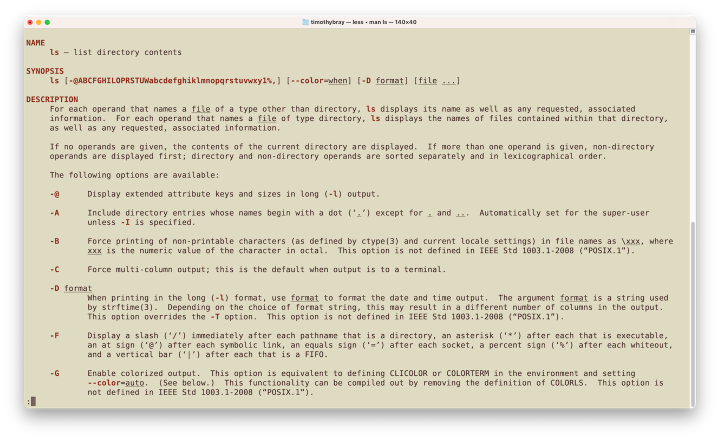
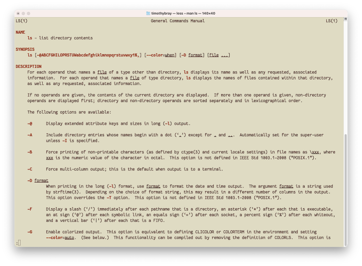
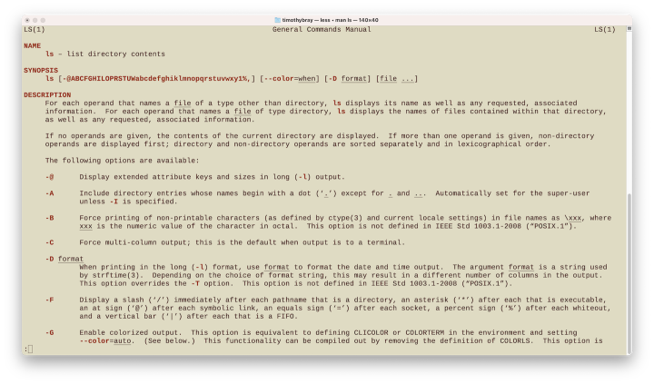
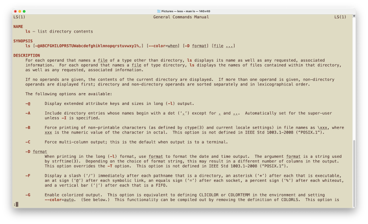
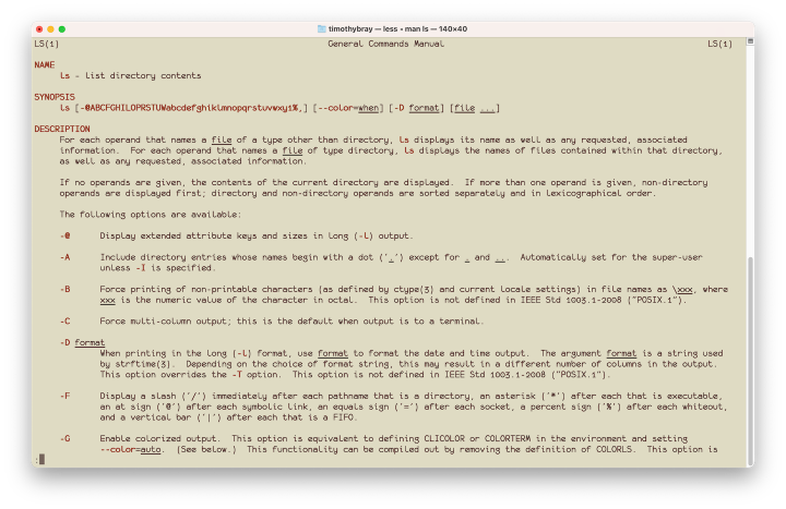
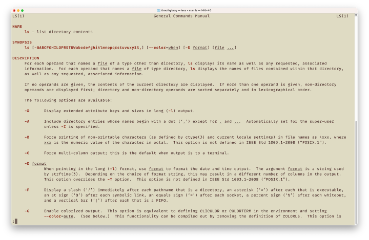
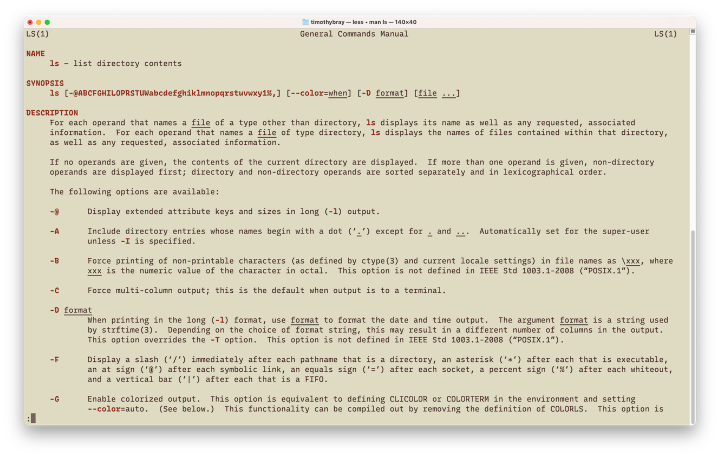
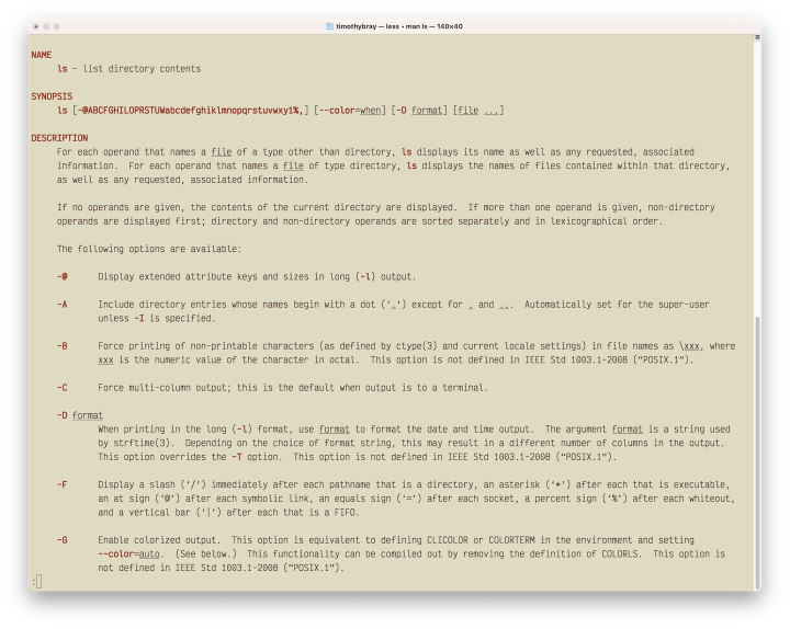
The methodology is the same as last outing. For each font, I post a shot of a the Linux ls(1) man page, switch Emacs into that font, and use it to write my feelings about it. Those fonts I consider excellent advance to round two, where I assemble screenshots of them displaying code in the Goland IDE.
In this episode: Anonymous Pro, Berkeley Mono, Cascadia Mono, Comic Mono, Courier Prime, Dank Mono, DejaVu Sans Mono, Fantasque Sans Mono, Liberation Mono, Menlo, monofur, MonoLisa, Recursive Mono Linear, and Victor Mono. Reactions of the form “But you didn’t look at X” will almost certainly fall on deaf ears.
Anonymous Pro · Start here.
“Anonymous Pro is based on an earlier font, Anonymous™ (2001), my TrueType version of Anonymous 9, a
Macintosh bitmap font developed in the mid-’90s
by Susan Lesch and David Lamkins.”
It’s pretty anonymous, all right; as in exhibiting no distinctive features. But it doesn’t vanish, and its over-excited attempt at smart quotes is offensive. Does not advance.
Berkeley Mono (not free) · Start here.
“Berkeley Mono wears a UNIX T-shirt and aspires to be etched on control panels in black synthetic lacquer. It is Adrian Frutiger visits Bell Labs. It is Gene Kranz's command. It operates with calibrated precision and has a datasheet.”
Really a lot of people who reacted to Part 1 of this were passionate about Berkeley, “Best money I ever spent”, etc.
I can see why, a lot of the letterforms are easy on the eye, and it’s pleasantly solid.
I won’t use it though, because the kerning hurts my eyes. “Wait!”, you say. “Monospace fonts don’t have kerning!” OK then, it’s just that the letters are too far apart and the spaces between them are non-uniform in a jarring way.
Also, the baseline of the type feels jagged, which doesn’t help my eyes flow along. Does not advance.
Cascadia Mono · Start here.
“Cascadia is a fun new coding font that comes bundled with Windows Terminal, and is now the default font in Visual Studio as well.”
It comes in Code and Mono, one of which has those coding ligatures. I’m in team anti-ligature but no biggie.
I can see why they said “fun”, it’s friendly and unassuming. But not for me, the letterforms are just too chunky-square, and it has the awful single smart quotes like Anonymous. Even if I used this in my IDE I wouldn’t in my shell, simply because of the broken underline, too small and squashed up against the bottoms of the letters. Doesn’t advance.
Comic Mono · Start here.
“A legible monospace font… the very typeface you’ve been trained to recognize since childhood. This font is a fork of Shannon Miwa’s Comic Shanns (version 1).”
Here’s where I get myself in trouble, because… I kind of like it. Some of the letterforms are objectively ridiculous (“D”, “e”). And, as Wikipedia says, quoting the BBC, “The typeface’s widespread use, often in situations it was not intended for, has been the subject of criticism and ridicule.” Clearly, the scenarios I’m considering here are not what Comic Sans was intended for.
But, to my eye, it’s readable and friendly and unassuming. The characters have a smooth horizontal flow. Granted, its line-height is slightly too small, so your text looks a bit squashed, but that’s really my only technical objection. And, Dear Readers, these little letters carry, among those of our tribe, consequential cultural weight.
It advances. Don’t shoot me. Plenty of my code is Comical. Are you against happiness?
Courier Prime · Start here.
“It’s Courier, just better…
…Designed for Screenplays
…Looks sharp everywhere.”
Disclosure: The Courier font was created in the year I was born, originally for the IBM Selectric, which was a fabulous piece of technology (for its day) and don’t you forget it. I spent years of my life more or less living in Courier (often Courier New Bold) on the screens of Unix workstations and X Terminals (If you don’t know what an X Terminal is, that’s OK. It’s not you, it’s me.)
There’s really nothing terribly wrong with this one. I could live with it. But our understanding of how to present electronic text has grown sufficiently during my lifetime that I don’t think Courier Prime deserves to advance in 2023.
But, maybe for screenplays?
Dank Mono (not free) · Start here.
“A typeface designed for coding aesthetes with modern displays in mind. Delightful ligatures and
an
italic variant and bold style.”
It’s OK, I guess. There’s only one thing wrong, but it’s fatally, unforgivably wrong: That lower-case “f”, which looks like a newt that got squashed on the pavement. If you can live with that glyph, this font might make you happy because it’s nicely light, perfectly legible, and has good flow. But not for me. Doesn’t advance.
DejaVu Sans · Start here.
“…a font family based on the Vera Fonts. Its purpose is to provide a wider range of characters while
maintaining the original look and feel…”
(Vera was a family from Bitstream released in 2001.)
I can’t find anything negative to say about this one. It doesn’t excite me or make me happy but it absolutely doesn’t get in the way. Nice flow, nice balance, nice line height. It’s got “Sans” in its name and serifs are rigorously eschewed (except for the almost-unavoidable lower-case “l”), which I think adds integrity to the design. Advances.
Fantasque Sans Mono · Start here.
“A programming font, designed with functionality in mind, and with some wibbly-wobbly handwriting-like fuzziness that makes it unassumingly cool.”
I detect a little influence from our friend Comic Mono, above? And I have to say that “wibbly-wobbly, etc” is not what I think I’m looking for in a working font.
But I don’t hate this. It’s balanced, clear, and readable. Its lower-case “g” with the bottom loop works, which most monospace attempts don’t. The tail on the lower-case “y” is kinda cute. Like Cascadia, in a shell window the underline styling is borked, but that’s a minor sin.
This is definitely not going to be for everyone, but there’s really nothing wrong with it. Advances.
Liberation Mono · Start here.
The Liberation family was commissioned by Red Hat from Steve Matheson. These have identical metrics to the default Microsoft Office fonts such as Arial and Times New Roman, and are the defaults in Libre Office.
It’s perfectly OK, really no complaints, but unfortunately the next font in this list does everything it does just a little better. So, doesn’t advance.
Menlo · Start here.
“a monospaced sans-serif typeface designed by Jim Lyles. The face first shipped with Mac OS X Snow Leopard. Menlo is based upon the open source font Bitstream Vera and the public domain font DejaVu.”
If it’s good enough to anchor the monospaced text in MacOS, it’s probably good enough for anyone. Certainly for me. The fact that I’m a long-time Mac user is probably influencing me here, but I can’t imagine this one really bothering anyone. Vanishes. Advances.
monofur · Start… uh, where? Doesn’t seem to have a home page.
“…a basic, fixed-width font
designed by Tobias Benjamin Kohler”
I’m not really sure what to say. The letterforms suggest Hobbit aesthetics, or maybe some other rural neighborhood in your favorite swords-and-sorcery books. They’re really not like anything else. “L” and “l” are unnervingly similar. The “a” should be wrong in theory but sort of works.
The whole font sort of works! Um… I like it? I don’t know if I’d seriously suggest it as a daily driver, but I’m going to advance it anyhow because I really want to see if it’s as charming in the IDE as it is here in my Emacs window.
MonoLisa (not free) · Start here.
“MonoLisa was designed by professionals to improve developers’ productivity and reduce fatigue.”
I have a problem with this, as I do with Dank: One bad letter. In this case it’s the lower-case “g”. What were they thinking? That tail looks like that poor little letter slipped in the mosh pit and crushed its sacro-iliac.
Having said all that, it’s pretty easy on the eye, and I’m inclined to put some weight on its home-page’s claim that it’s optimized for readability. That “g” is not (quite) as egregious as Dank’s “f”, so should probably let it advance. Clever name, too.
Recursive Mono Linear · Start here.
“A typographic palette for vibrant code & UI”
Whereas I’ve been friendly to a couple of less-than-serious fonts above, I can’t get past the way this one presents all-caps; they look like menu text in one of those diners where they interview MAGA voters. Just not something I need invading my work-day. Doesn’t advance.
Victor Mono · Start here.
“The typeface is slender, crisp and narrow, with a large
x-height and clear punctuation,
making it
legible and ideal for code.”
No thanks, not for me. There are people who like this kind of thing, see Iosevka in the last instalment. This is way more polished than Iosevka but that’s a low bar. I can’t imagine inflicting this one on myself. Doesn’t advance.
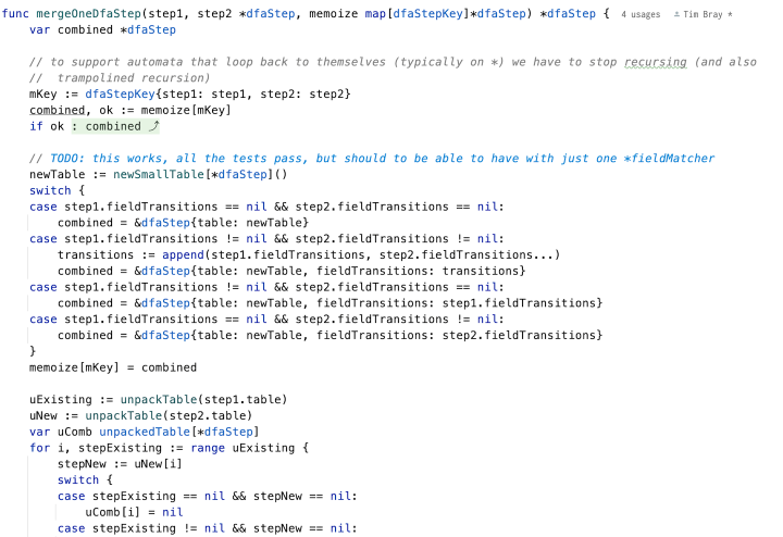
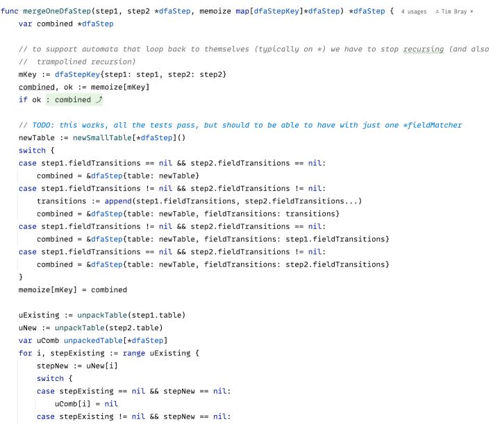
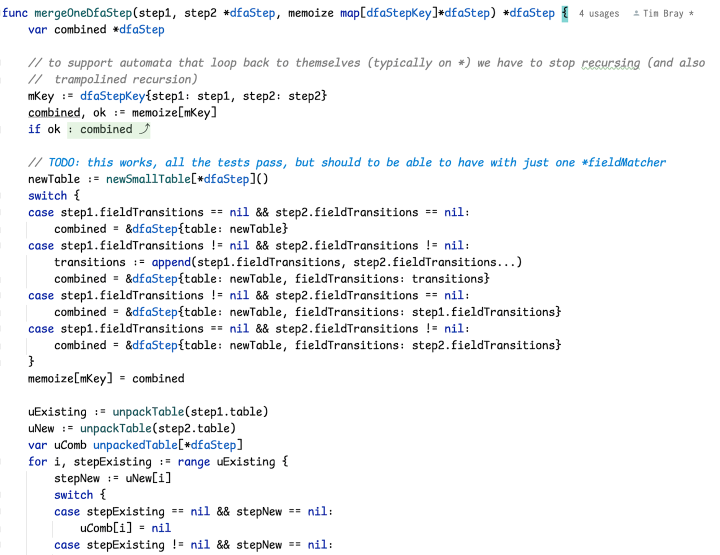
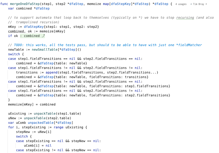
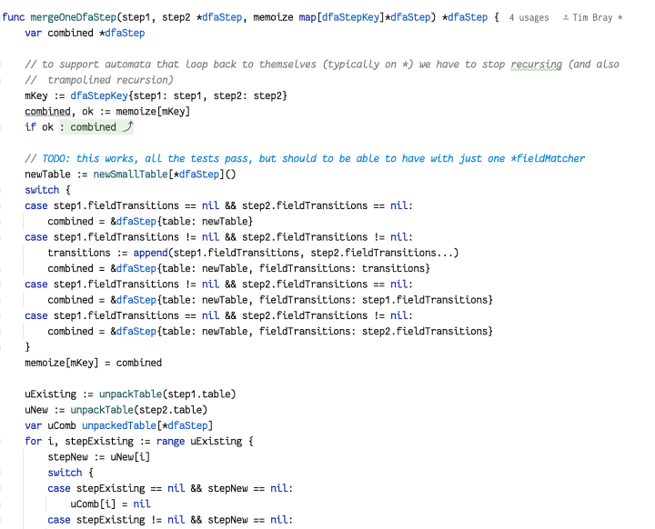
The finalists · That leaves Comic Mono, DejaVu Sans Mono, Fantasque Sans Mono, Menlo, monofur, MonoLisa. Let’s go look at some actual code, from this file.
Here they are, but they’re not alphabetical, because I want you to look at them; scroll back and forth a bit. See if you draw any impressions before you check which is which.
· · ·
· · ·
· · ·
· · ·
· · ·
You can tell which is which by click-to-enlarge and look at the labels, or the filenames.
Sidebar: Dark mode? · I use dark-on-light in almost all my apps on almost all my devices. I even know why: I spent the first decade or more of my career working on ASCII terminals, 24 80-column lines in green or orange or white on black. If you got an upscale terminal from Ann Arbor or Falco, you could have 40 lines, and you were an aristocrat.
When modern bitmapped workstations showed up and had black-on-white like paper, it felt obscenely luxurious, and I’ve never gotten over that. But I digress.
I know a majority of people who look at code these days do it in dark mode. It’s fair to wonder whether that would change any of the impressions or conclusions here. Don’t ask me, though.
Conclusions? · There’s nothing here I couldn’t use.
Menlo’s the winner, by a mile. It does everything any of the others do, plus it fits more lines into your editor window than the competition. I think it’s the only one that’s going to join my all-star repertoire of Fira Code Retina, Hack, JetBrains Mono, and Inconsolata.
It’s a little annoying that none of the non-free fonts are firmly in the top tier; although I could learn to live with that sketchy MonoLisa “g”.
There will be times when I’m fighting some galactically stupid bug, or writing a blog about some catastrophically sad problem, when I may resort to Comic Mono or monofur, just to cheer myself up.
如有侵权请联系:admin#unsafe.sh
