2022-3-31 01:52:1 Author: www.sentinelone.com(查看原文) 阅读量:24 收藏
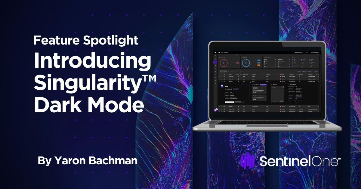
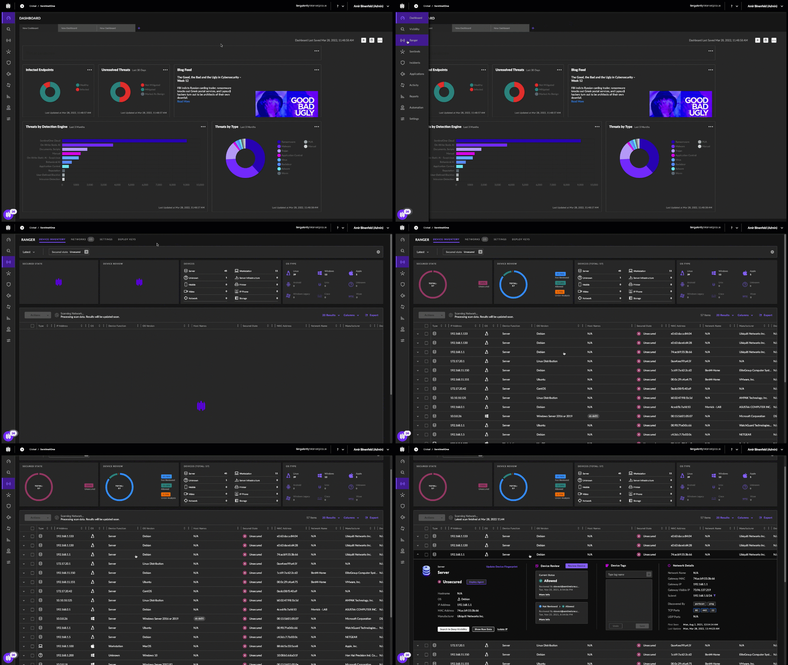
We’re excited to announce the availability of Singularity Dark Mode, an optional UI feature now available to all our customers. In this blog post, we’ll explore the origins and advantages of Dark Mode, explain why it was important for us to offer Singularity users this choice, and offer a step-by-step guide on how to take advantage of this great new feature.
Dark Mode Returns
The first digital interfaces were powered by Cathode-Ray Tube (CRT), a technology that was invented for use in radars during WWII. Initially, CRT technology wasn’t efficient enough to illuminate an entire surface. Hence, for the very first computer screens, dark mode was default.
By the 1970’s, technology was more advanced and the concept of WYSIWYG interfaces was introduced. This new approach, based on the assumption that displays were like printed paper (although paper doesn’t glow), introduced Light Mode as we know it today. For a long time, Light Mode has been the default condition. However, Dark Mode has become an increasingly popular feature in mainstream products. Modern digital screens are far more advanced than CRT ones, yet, decades later, there’s a striking similarity between the old and the new.

The Advantages of Dark Mode
The science behind Dark Mode is still a little shady, with lots of conflicting views and evidence as to its benefits. That being said, here are a few things that are generally agreed upon:
- A Step Forward in Accessibility: Reduced contrasts have been proven to help people with light sensitivity or visual impairment.
- Less Harmful to Sleep Cycle: Emitting less blue light, Dark Mode has less impact on Melatonin levels (the hormone that makes us tired).
- Better for Dimly Lit Environments: Lower contrasts reduce eye-strain significantly, so when working in a dark environment, Dark Mode is easier on the eyes.
- Super Slick Look & Feel: A big driver of dark mode is aesthetics. Many people simply have an affinity for Dark Mode and the aesthetics it entails.
Best Practice: Freedom of Choice
There’s no doubt that some people prefer to work in Dark Mode while others do not. Some people prefer to work in Dark Mode at certain times, but not at others. We realized that it was important to give our users the ability to experience a product in their chosen contrast polarity, and allow them to switch easily between light and dark modes.
We also realized that the benefits of choosing between Dark Mode and Light Mode could only really work if it was customizable by each user. Putting the decision into the hands of the individual user ensures a more pleasant experience when using our products. We know that people rarely change defaults, but they should be able to do so when they wish and with ease.
Introducing Singularity Dark Mode
Being a customer focused company, Singularity Dark Mode was designed with our users in mind. Contrasts were adjusted to comply with universal WCAG AA accessibility standards and the feature, as a whole, was tested as a Beta on selected customers and perfected over numerous feedback iterations.

Singularity Dark Mode is now available to all customers.
Switching to Singularity Dark Mode
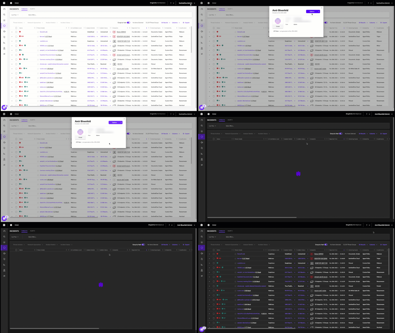
It couldn’t be easier to switch between light and dark modes for your user profile.
- Open the Management Console on your browser.
- In the top right corner, click on your Username and select My User
- In My User, click the Options menu and select Switch to Dark Mode
- To revert back to Light Mode, select Switch to Light Mode from the Options menu
Path Summary:
Username / My User / Options / Switch to Dark Mode

Conclusion
Given that Singularity Console sees frequent use, it makes great sense to give our customers the option to view the UI in the way that makes them most comfortable and that enhances their personal productivity. The introduction of Dark Mode for Singularity reflects our belief that products that are meant for long-form consumption should offer a Dark Mode feature and the option should ideally be pervasive throughout all the screens of that product.
If you would like to learn more about how SentinelOne Singularity can help protect your organization, contact us or request a free demo.
如有侵权请联系:admin#unsafe.sh